What’s next for Symbolset

Symbols have played a vital part in human communication for around 40,000 years1. From early cave paintings, carved hieroglyphs, and eventually to modern pictograms as seen and recognized in every restroom and airport.
Symbols break down language barriers, and allow us to communicate more efficiently.
U.S. Department of Transportation pictograms, 1974
Symbolset is a platform for making symbols semantic and accessible, returning iconography to its roots as a communication device.
This is the story of why we built Symbolset at Oak, why icon fonts matter now more than ever, and what’s next for Symbolset as a product.
Symbolset teaser, 2012
It was 2011, and the state of stock icons for user interface design was pretty bleak. At Oak, choosing icons for a client project typically meant wasting hours sifting through folders of crudely drawn vector files, bringing these into Photoshop to apply snazzy emboss effects2, and exporting these as PNGs. If you are someone like our designer Mike Fortress, you also spend time cleaning up stray points in Illustrator and reconciling inconsistencies between icons.
This repetitive process had Mike thinking about designing his own set of icons. As he was already dabbling in typeface design, he aimed to create a well-crafted set of icons drawn with the sensibility and discipline of a cohesive typeface. In fact, why not make it a typeface? That’s a thing, right?
Icon fonts
Symbol fonts are not a new concept. They have been used throughout the history of the printing press, sold and used alongside type as ornaments, and commonly referred to as dingbats.
For years our computers have shipped with common symbol fonts like Zapf Dingbats (1978) which would eventually become part of Unicode; Wingdings (1990); and Webdings (1997) designed by, among others, Vincent Connare of Comic Sans fame.
2011 was a hot year for webfonts, Adobe had just acquired Typekit. We saw people experimenting with putting user interface icons into webfonts. Interesting things were happening, but something wasn’t quite right.
Made with k in NYC
For years, Vimeo.com used one of the more popular icon fonts in their footer with the message “Made with ❤️ in NYC”. However, since this particular font mapped icons to A-Z characters, it actually said “Made with k in NYC”. This is how Google and screen readers would have interpreted the icon, and it made us think.
We could do better.
With Symbolset, we aimed to make icons meaningful, easy, and accessible for both humans and computers.
Our approach is three-fold:
-
Semantically map icons to Unicode standards. A heart should map to U+2764, so a heart is a heart not a letter k.
-
Use OpenType ligature features to represent common terms in icon form while retaining screen reader accessibility (a heart can be read as “love” or “heart”).
-
Include CSS and JavaScript implementations for use on the modern web.
Mapping our icons to standard Unicode values not only allowed us to be consistent across all sets we release, but be interoperable with other font vendors and platforms as well. Our dream was to allow designers to choose an icon font, use it in their layout, and easily swap between icon sets—just as you would with any text font. We’re still pretty happy with how that turned out.
Now more than ever
Are icon fonts still relevant? While some party poopers have declared “death to icon fonts”, we think that’s a load of 💩 and icon fonts are absolutely the future.
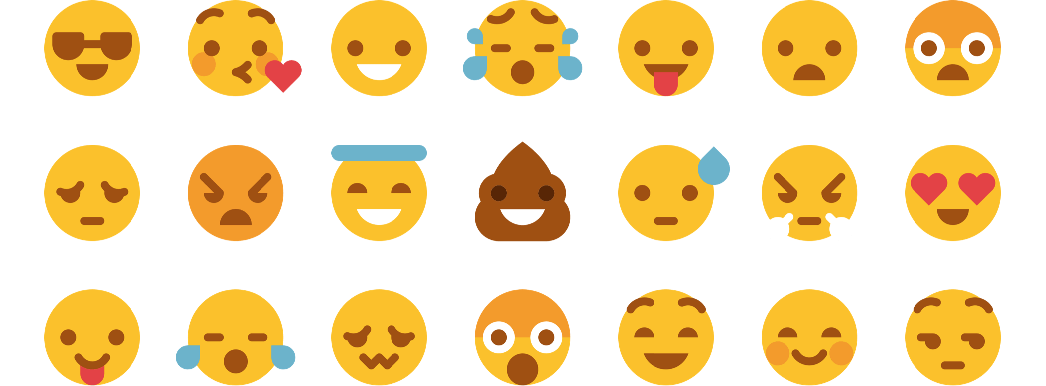
One only has to look to emoji and its incredible rise to see why icon fonts are ubiquitous and here to stay. Exactly like Symbolsets, emoji are icon fonts mapped semantically to Unicode values.
There are many emoji fonts, but Apple Color Emoji is probably the most well known. In a recent study, 92% of online consumers report using emoji3. That’s a lot of people using icon fonts every day.

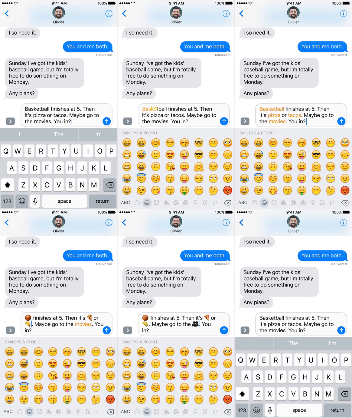
Apple’s upcoming iOS 10 features emoji prediction, reminiscent of Symbolset’s keyword functionality
A ⭐ or 🍔 written in emoji can be shown in Symbolset just the same. Unlike image formats like PNG or SVG, computers understand exactly what ⭐ or 🍔 means. Fonts work on any device with a display, and are future-proof in a way image formats can’t be. For as long as we have text, we’ll have fonts.4
With advancements in multicolor fonts, we’re pretty excited about what’s to come.
So what’s next
There are so many things we haven’t accomplished with Symbolset yet.
We released 15 icon sets from 2012 to 2015, but like traditional typefaces, we think there’s room for infinite more. We believe icon sets should be chosen to reflect your design, and even pair with your typographic choices. Luckily, there are talented icon designers today pushing the craft forward (many of which we’ve been able to work with5).
In addition, we’ve always dreamed of working with the Unicode Consortium to create a block for common user interface icons, and open our icon mapping system to other vendors.
Hell, Google pretty much stole it anyway. They got the keywords mostly right, but unfortunately missed the point of Unicode (this is why we need standards!).
All of this is to say we have huge ambitions for Symbolset, but with our small team and other growing products we were unfortunately not able to dedicate enough resources to make it sustainable.
Still feeling passionate about growing Symbolset however, we reached out to everyone from established creative software companies, type foundries, young icon startups, and ultimately found a new home with our buddies at Fort Awesome (formerly Fonticons).
We knew Symbolset needed a team that is devoted 100% to solving icons, and we think these are the folks to do it. These are the same people who make Font Awesome, which is currently being used on an incredible 73 million websites. They’re backed by Y-Combinator and have some exciting things planned for the future.
We’ll be honest, most acquisitions suck. Especially for users who get left behind while the founders run off on their incredible journey. We didn’t take this lightly and very little money switched hands. We mostly were concerned with finding a team who could continue operating Symbolset as it is, and we worked hard to find the best possible fit for our users. As a user, you shouldn’t have to worry about any disruptions. But look forward to awesome stuff in the future!
To close, I thought I’d share our original Symbolset purpose:
- Make great icon design available to the world.
- Make icons semantic, meaningful, and accessible to humans and machines alike.
- Make icons easy to implement and technology-agnostic.
- Make icon design a viable profession for talented icon designers.
We look forward to seeing Fort Awesome continue this mission, and make icon fonts great again.
Cheers to Dave, Travis, and the rest of the Fort Awesome team.
-
Hey, it was 2011. ↩
-
Though at the rate emoji is growing, maybe we’ll be reading paragraphs of symbols soon enough. ↩
-
Huge thanks to Mike Fortress and all our of Symbolset designers: Jory Raphael, Hemmo de Jonge, Joseph Wain, Brent Jackson, Kyle Steed, and Wen Ping Huang. ↩