Oak wins a Brand New Award
The 2011 Brand New Awards have been revealed, and we’re excited to announce our work for Quarterly Co. is a winner in the Basic Identity Application category.
![]()
Quarterly logo
Quarterly is “a subscription service for wonderful things.” This online service ships physical items to customers from influential contributors of their choosing. Contributors include Tina Roth Eisenberg, John Maeda, Mike Monteiro, Liz Danzico, and more. Each contributor sends a themed shipment but the contents of that shipment are a mystery to the subscriber.
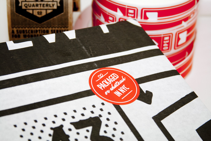
Packaged or whatevuh in NYC
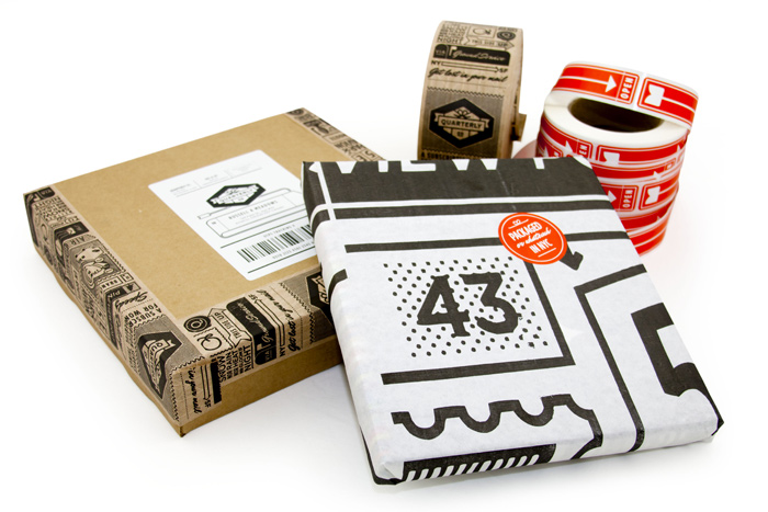
Quarterly packaging
The postal service offers a rich visual history. There are common themes honoring couriers, the airmail service, the pony express, and others. We chose a style that would allow us to blend in with contemporary startups while honoring the heritage the postal service offers. We chose to honor the package as the iconic twine-bound box. The perspective on the box creates a unique silhouette.
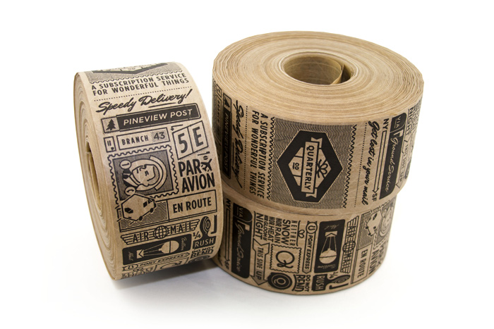
Custom kraft tape
Package size and shape is different for nearly every shipment. We designed flexible elements such as tape and stamps that can adorn a variety of packages. We specified color and illustration style but the brand remains malleable. The linear style has a sense of nostalgia, can be used to illustrate and letter any number of things, and reproduces well on cardboard and as stamps. The illustrations on the packaging salute about a dozen pop culture references (which Seinfeld character resides in apartment 5E?).
The website follows basic commercial patterns. Tactile effects and styles were used in the interface to introduce some of the warmth seen in the packaging.

http://quarterly.co
Check it out at http://quarterly.co.