A more accessible drag & drop

Organizing your items in collections and stacks is an essential part of the Dropmark workflow.
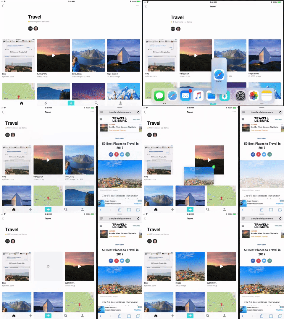
During development of Dropmark for iOS, we saw the opportunity for a more natural way to interact with your items: drag and drop.
Back in June 2017, Apple unveiled the drag and drop API for iOS 11, and we instantly fell in love with the inter-app drag and drop gestures on the iPad Pro. It’s so easy. You can pick up text, a link, or even an entire file, and place it exactly where you want it in your Dropmark collection.
Currently, Apple’s official API is the sole option for systemwide drag & drop. This bit of magic is limited to people with the newest iPad Pros running the latest iOS. We challenged ourselves to broaden this experience for all iOS users.
We are proud to announce: StackedCollectionView. An open-source Swift library to standardize the drag & drop experience.

StackedCollectionView is a UICollectionViewFlowLayout subclass, providing an easy way to integrate drag & drop into your existing collection view. This structure peacefully coexists with iOS 11’s drag & drop, enabling you to support drag & drop on older operating systems, while still making use of Apple’s API on iOS 11.
Learning the Apple way
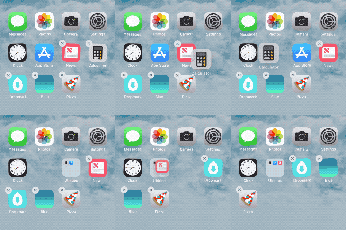
Apple introduced a rearrangeable home screen way back in iOS 1.1.3, and iOS 4.0 saw the addition of folders. Organizing and classifying apps quickly became a centerpiece of the iOS experience.

By emulating gestures from the iOS home screen, our app users could intuitively use familiar gestures to organize their content.
Let’s get technical

StackedCollectionView takes action as soon as an item is long pressed. The thumbnail snaps to the user’s finger, and our drag session begins.
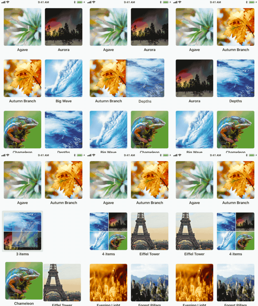
As the user traces the screen, we analyze the underlying cell for trigger points (quickly to maintain a smooth frame rate on older devices). Like the iOS home screen, we focused on a nuanced “pressure zone” around each item. When the finger pauses briefly above the outer 30% of an item’s bounds, a “reorder” gesture is triggered and the underlying item shifts of the way.
When the user pauses within the inner 70%, we trigger a “stack” gesture, and the cluster below animates to receive our drag item.
When the finger lifts off the screen, animations are committed, and the item settles into place. A set of delegate methods provide hooks to update your local model, send a network request, or add extra animation awesomeness.

Try it, use it, break it, fix it
We love open source at Oak, and we’re excited to share one of our favorite parts of Dropmark for iOS. Grab the library and sample app on GitHub, and let us know if you make anything radical 🎉